GALLERY | PRINTS
I first became aware of Pamela Schiffer’s work right after she demonstrated the good sense to come to Livingston, Montana to work with Geoff Harvey at his Sunlight Graphics printshop. I’ve collaborated with Harvey now for 11 years and consider him to be the pre-eminent fine art printer in America. It took me ten years to learn lithography working with an uncooperative rummy. Schiffer on the other hand was led into the process by a genius to whom she listened, and the result was a set of original prints which constituted a home run her first time at bat.
Prior to her introductory effort in lithography, Schiffer's medium was oil paint. However, no matter whether in painting or printmaking, she appears to have been able to apply the same simplicity and sensitivity to the natural world.
--Russell Chatham
The Livingston Suite—Original Lithographs
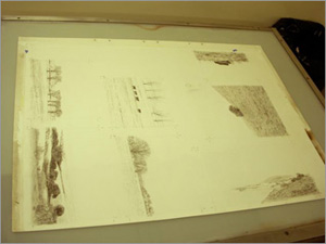
The first stage: 7 key drawings, using a lithograph pencil
This suite of seven lithographs was created in 2008 and 2009 at Sunlight Graphics in Livingston, MT. I collaborated with master printer, Geoffrey Harvey, who trained at the Tamarind Institute in New Mexico. Harvey has years of professional experience, including many years of collaboration with the world-renowned lithographer and landscape painter Russell Chatham.
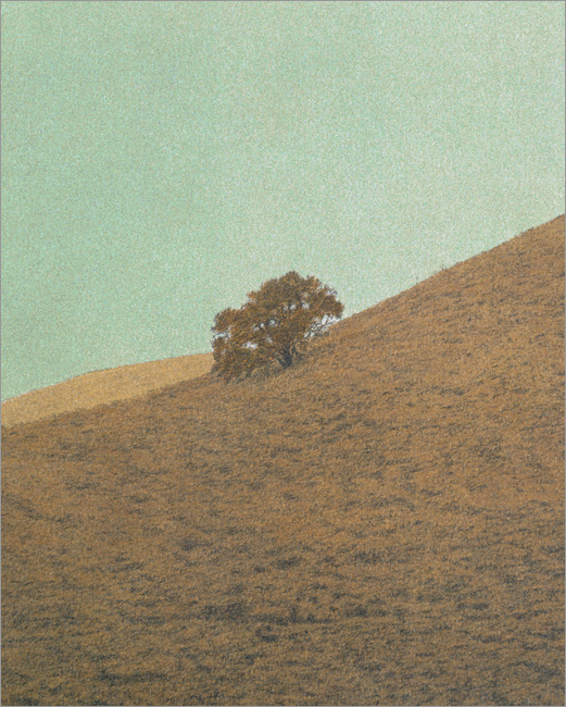
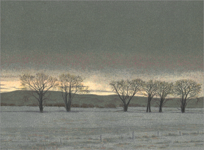
The suite includes images from Hollister Ranch, north of Santa Barbara, and from northern Wyoming, where I was an artist-in-residence at the Ucross Foundation in 2008. Using multiple layers of colors, much like I use glazes of oil paint, I attempted to evoke the atmosphere and light of these remarkable places. The prints are created on an offset press from metal plates that are etched from my original drawings.
The suite required twenty-four separate color runs through the press, although no single image received more that twenty-two colors. Unlike giclee prints and mass-produced art prints, these images are not created through a photographic or digital process; each color required a separate drawing and a separate press run, and the resulting prints, built up color by color, cannot be recreated once the suite is finished. For this reason, they are called “original lithographs.”
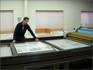
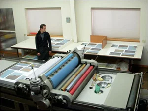
Geoff Harvey printing one of the initial runs of color
Lithography is the most common method of commercial printing. It dates from the 19th century, when both commercial and fine artists such as Manet and Toulouse-Lautrec drew in oil-based ink on slabs of Bavarian limestone. The process relies on the mutual repulsion of oil and water; once the stone was etched to preserve the image, it could be sponged with water, then rolled with an oil-based ink and run through a press to create the print.
Additional colors could be added by re-etching and printing over the first color. In the 20th century, metal plates replaced stones, and photographic processes allowed printers to transfer all types of images to the plate. In addition, the offset press, in which the image is not printed directly from the stone or plate, but is picked up from the plate onto a roller, which then rolls the image onto the paper, became the prevalent method of reproduction, used by newspapers, magazines, and most commercial printers. Eventually, images could be translated into a matrix of red, yellow, blue and black dots that create the illusion of a “full-color” image.
Geoff toward the end of the project; here, we've done
about 20 color runs.
It’s a complicated process to produce an original lithograph. The first step is to create a key drawing of the desired image. The drawing is then transferred to an aluminum plate. The image will usually be printed in black ink—if further color work is desired, this key drawing acts as the base to receive multiple layers of transparent color.
Each color requires a separate plate and run through the press. I drew directly onto a clear mylar sheet, which was then laid over a photosensitive metal plate, exposed, then etched to prepare it for the printing process. Areas that did not receive a given image were masked. In order to create soft, luminous effects, I used an airbrush for some colors. Layers of color are built upon each other, as in a watercolor painting, to impart qualities of tone, density, space, and even mood, in an image. The artist is directly involved in every step; each plate is hand-drawn and requires several decisions, such as designating where the new color shall go in the image or where it is blocked, how dense its application be, and if any more drawing is needed. A color is decided upon by the artist and then is hand-mixed. Modifications to the ink color are sometimes necessary once a test is run due to its interaction with the underlying colors; the artist approves each impression before the edition is run.
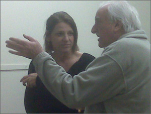
Pamela and Russell Chatham, discussing the prints
The overall process is a labor-intensive collaboration between the artist and printer, and it can require hundreds of hours of time to produce an original lithograph. These lithographs are printed on a Mailander Press, using Coventry (350 gm. 100% cotton rag, acid-free) paper and Quality Ink. There are 150 prints of each image in the edition; due to the process they can never be recreated.
